I finally got tired of hearing about it so I thought I’d do a little research to see if the numbers might support the proposition. I mapped the tax rate assessed against those in the highest tax bracket (and for the sake of comparison, I mapped the lowest tax rate, too). Then I looked up the unemployment statistics and mapped them as well.
I looked at the period from 1948 to 2009. The post-WWII years are universally recognized as America’s most productive years …. the heyday of our growth. I discount much of the so-called “growth” of the last 15 years or so on the grounds that it was a fantasy based on over valued real estate. The recent real estate “bust”, with home values plunging faster than anyone could track, foreclosures, and the implosion of the over leveraged financial sector is evidence of that fantasy. The value, labeled “growth” by my friends on the right was an illusion. It was a house of cards, propped up by a banking Ponzi scheme that “monitized” bad debt by bundling shaky mortgages sold on the premise that home prices would never go down and repackaged into financial instruments to conceal their flaws.
So, let’s look at the numbers.
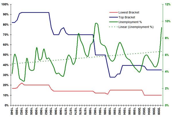
Sources: IRS and US Bureau of Labor Statistics.
For the sake of this exercise, the Blue line at the top represents the highest marginal tax rate in effect during each tax year. One can read the tax percentage on the scale at the left of the graph. The Red line at the bottom similarly indicated the lowest tax rate and, again, the percentage can be read on the scale at the left of the graph.
The solid green line tracks the rate of unemployment from 1948 to the present while the green dashed line is the linear trend line of the unemployment rate through that period.
What I noticed is that there is a very high inverse correlation between the highest tax bracket rate and unemployment. What I mean by this is generally the lower that tax rate, the greater the rate of unemployment. As one tracks the tax breaks extended to the wealthy versus the unemployment trend line, one gets the distinct feeling that the conservative mantra of lower taxes equaling a stronger economy seems to fall apart assuming the rate of unemployment is any measure of economic strength.
No comments:
Post a Comment