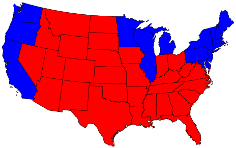
Map credit: Michael Gastner, Cosma Shalizi, and Mark Newman, University of Michigan
The state by state map is a little deceptive, particularly in light of the fact that the overall margin that the Republican Party won by in 2004 was on the order of 1.5% ... that is to say, closer than a 49:51 win.
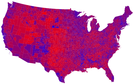
Map credit: Michael Gastner, Cosma Shalizi, and Mark Newman, University of Michigan
Breaking the overall voting down by county gives a better understanding of what that actually meant. Democrats tended to win in more urban areas (where people actually live) while the Republicans took those areas where the deer and the antelope play (imagine the sound of crickets chirping).
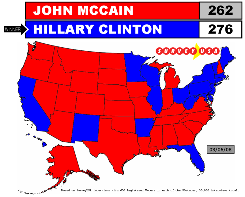
Looking into the future, pollsters are predicting the map will look like this going into the 2008 election if Clinton is the Democratic Party nominee: (And we know how "right on" the pollsters been.)
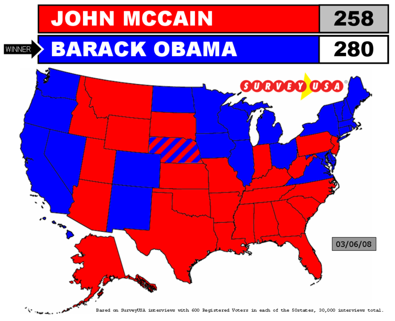
... and like this if Obama is the Democratic nominee:
I'm looking forward to a county by county breakdown once Obama is President. I suspect it will be a very different shade of purple.
No comments:
Post a Comment